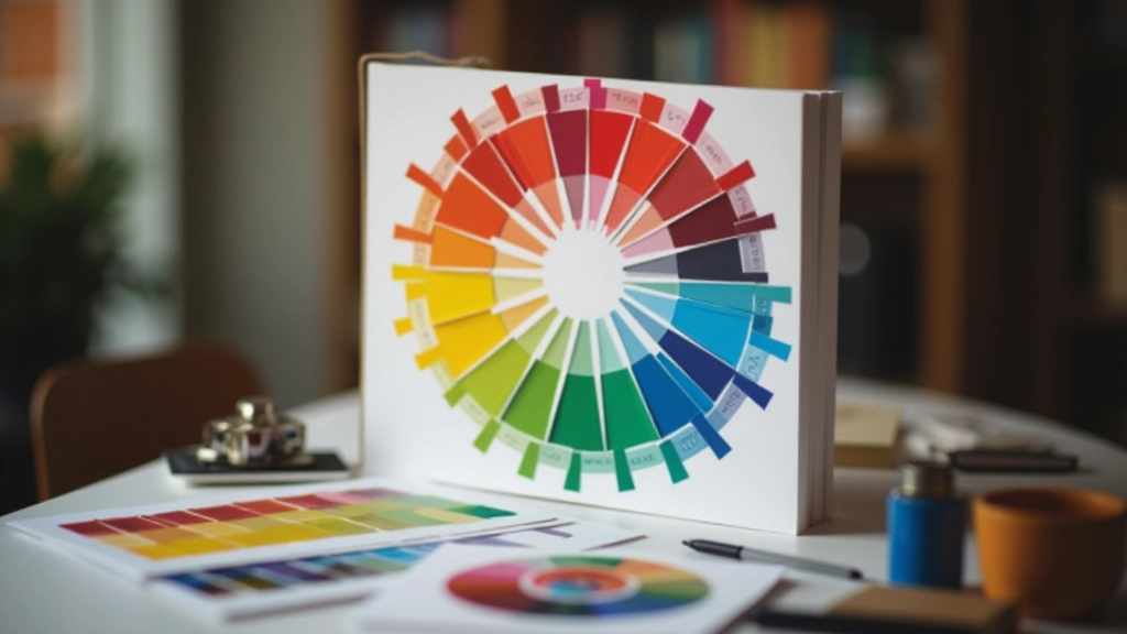
Understanding Colour Wheel Relationships
Learn how complementary, analogous, and triadic colour schemes work together to create visual harmony in digital layouts.
Read GuideLearn how to create visually harmonious digital experiences through proven colour principles, accessible contrast ratios, and emotional colour psychology
Colour isn’t just visual decoration. It’s a powerful communication tool that shapes user experience, builds brand identity, and creates emotional connections with your audience
Understand how complementary and analogous colour relationships create balanced, pleasing designs that don’t overwhelm the viewer
Learn WCAG contrast ratio standards and practical techniques to ensure your colour choices work for everyone, including those with colour blindness
Discover how different colours trigger psychological responses and how to leverage colour psychology to guide user behaviour and build trust
Build cohesive brand palettes that stay consistent across all digital touchpoints while remaining flexible for different contexts
Deep dive into the fundamentals of colour relationships, accessibility standards, and palette creation
Learn how complementary, analogous, and triadic colour schemes work together to create visual harmony in digital layouts.
Read Guide
Discover WCAG standards for contrast ratios and practical techniques to ensure your colour choices work for all users, including those with colour blindness.
Read Guide
Create unified colour systems that remain consistent across all digital touchpoints while staying flexible for different design contexts and applications.
Read GuideA structured approach to implementing colour theory in your web design workflow
Understand your target users’ cultural backgrounds, preferences, and accessibility needs. This foundation shapes every colour decision you’ll make moving forward.
Choose a colour harmony scheme that aligns with your brand personality. Complementary creates energy, analogous feels calm, and triadic offers balanced complexity.
Develop a complete system with primary colours, secondary variations, and neutral tones. Test combinations for visual balance and ensure accessibility compliance.
Validate contrast ratios against WCAG standards. Test with real users across different devices and lighting conditions. Iterate based on feedback.
We believe in teaching colour theory grounded in research, accessibility standards, and real-world application
Colour theory isn’t just an art—it’s a science. We’ve been teaching designers since 2019 how to use colour strategically, not randomly. Our approach combines colour psychology research with practical accessibility guidelines, helping you create designs that look beautiful and work for everyone.
We don’t believe in vague design advice. When we teach colour relationships, we show you exactly why complementary colours create visual interest. When we discuss contrast, we walk through WCAG standards with real examples. When we talk about brand palettes, you’ll learn frameworks that scale from startups to enterprise systems.
Every guide you’ll find here comes from years of helping designers solve real problems: building accessible interfaces, creating consistent brand systems, and understanding why some colour combinations work while others clash.
Every principle grounded in colour psychology and design research
WCAG standards built into every recommendation
Learn frameworks you can use on your next project
We’ve answered questions from hundreds of designers learning to master colour in their work
Complementary colours sit opposite each other on the colour wheel and create high contrast and visual energy. They’re great for CTAs and drawing attention. Analogous colours sit next to each other and feel harmonious and calm. They’re perfect for cohesive brand systems and background palettes.
Contrast ratios ensure text and important elements are readable for everyone, including people with low vision or colour blindness. WCAG AA requires 4.5:1 for normal text and 3:1 for large text. It’s not just a legal requirement—it’s good design that works for your entire audience.
Use tools like WebAIM Contrast Checker or Accessible Colours to test your colour combinations. Simulate colour blindness with tools like Color Blindness Simulator. Test on different devices and in different lighting conditions. Don’t rely on theory alone—real-world testing catches issues design tools might miss.
Yes, but with nuance. Colour does trigger psychological associations, but cultural context matters significantly. Red can mean danger or prosperity depending on culture. Blue generally feels trustworthy across cultures, which is why it’s popular in finance. The key is understanding your specific audience and testing your assumptions.
A solid brand palette typically includes 1-2 primary colours, 2-3 secondary colours, and neutral variations. This gives you enough variety for visual interest without becoming overwhelming. We’ve seen systems with as few as 5 colours work beautifully and others with 20+ colours that stay cohesive through clear rules about where each is used.
Master the skills that separate competent designers from those who truly understand visual communication
Master complementary, analogous, triadic, and split-complementary schemes to create harmonious colour combinations instantly
Understand contrast ratio requirements and how to test colour combinations for people with colour blindness and low vision
Build scalable colour systems that work across different contexts and maintain consistency while staying flexible
Learn how different colours influence perception, emotion, and user behaviour in digital interfaces
See how colour theory applies to actual projects, from startup dashboards to enterprise platforms
Discover tools and techniques to validate your colour choices and iterate based on real user feedback
Start exploring our comprehensive guides on colour wheel relationships, accessibility standards, and brand palette creation. Whether you’re designing your first interface or refining a mature system, we’ve got the knowledge you need.
Have questions about implementing colour theory in your projects? We’re here to help. Contact us anytime.